

More and more people are talking about User Experience (UX) and how it can be a differentiator in a crowded marketplace or a selling point for B2B digital services. At its core, UX is about considering the needs of the people who will be using the product (website, app, etc.) you are designing and then going a step further and placing your users—not yourself or the CEO—at the center of the design process. It’s a fairly abstract concept, so let’s take a look at what good UX Design looks like through some concrete examples. The following 10 sites are handpicked to illustrate specific principles of good UX Design, from simplicity to gamification.
Websites & Apps that Understand Humans
1. Rover: Using Reviews to Build Trust
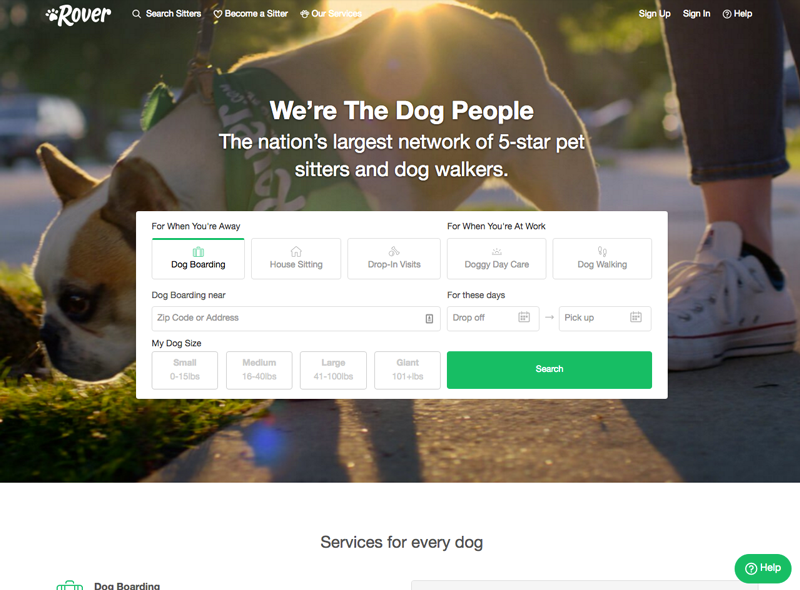
For many people, dogs are not just pets but members of the family. So when you need to leave town without Fido, who can you trust to take good care of the family dog? That’s where Rover comes in and not only makes it simple to pick out a sitter and book them, but also makes you feel good about your choice through online reviews and photo updates while you're gone. What Rover understands about its users is how important trust is, particularly when it comes to leaving your furbaby with a stranger for the weekend.
2. Duolingo: Tearing Down Roadblocks
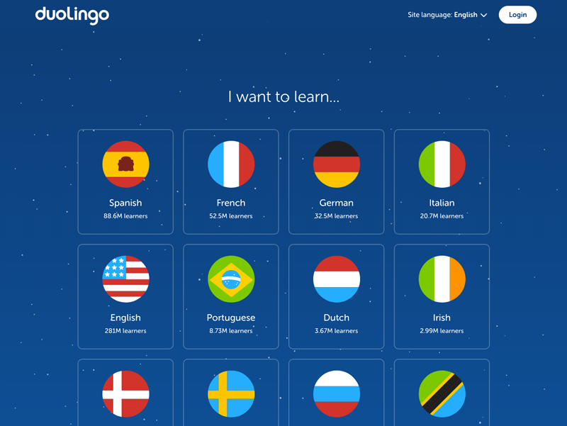
Duolingo wants to help you learn a new language, which is a challenging task that can feel overwhelming. After three easy questions, users are already starting to learn a new language and have set a goal for their learning. This frictionless approach is contrary to many competitors. Rosetta Stone makes their users decide on a plan, pay and sign up for an account before getting started. Each of these steps adds friction which can cause users to drop out of the process.
3. Paypal: Letting Simplicity Rule
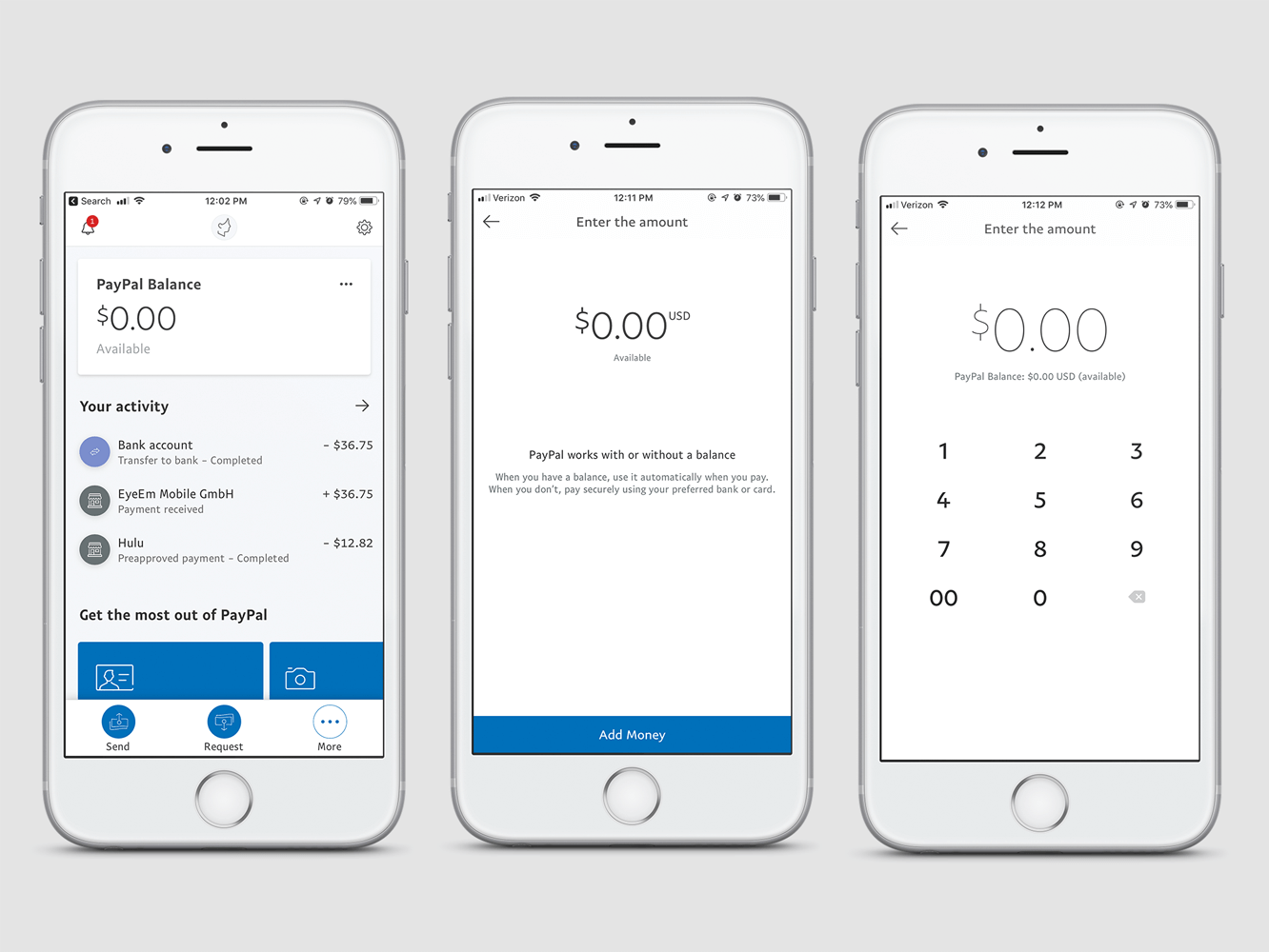
Before Paypal rolled out their redesigned website in 2014, the site was overly complex. Since then, Paypal has been in the process of simplifying their website and mobile app experience. Several of John Maeda’s Laws of Simplicity are at play here: reducing, organizing, positioning, creating context, adding meaning and saving time.
4. MailChimp: Humanizing Technology
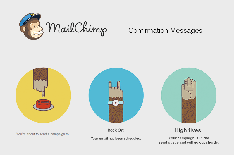
MailChimp gives their web application a face, though not a human one. Their mascot, a chimp named Frederick von Chimpenheimer IV (or Freddie for short), pops up throughout their interface adding humor, high fives, and an emotional connection with users. This humanization of technology adds depth to the otherwise sterile and frankly boring experience of managing your email marketing. The application becomes less like a tool and more like a team member you are working with to get the job done.
5. Starbucks: Making it Personal
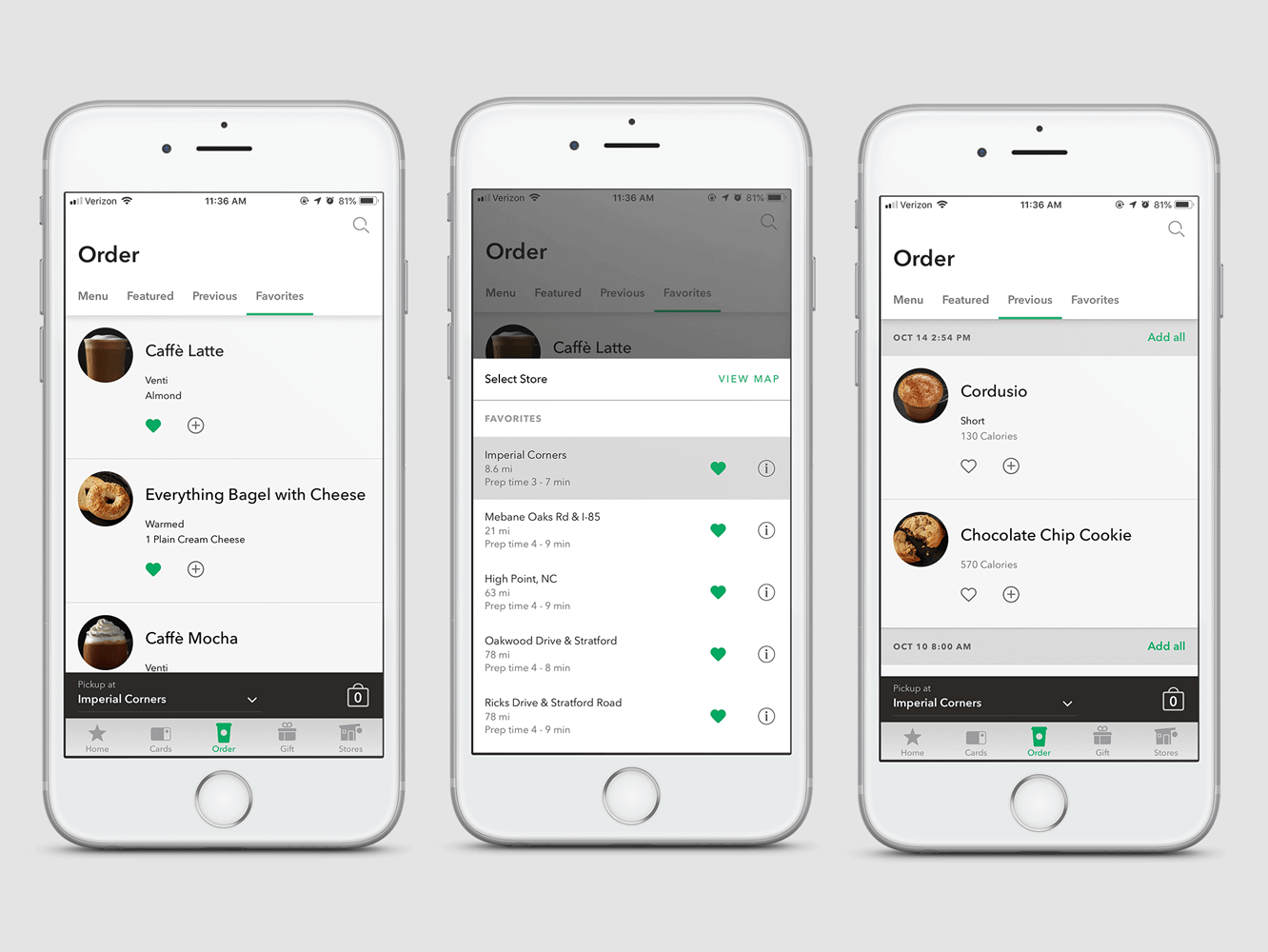
Starbucks uses smart personalization in their mobile app for online ordering by understanding users’ purchase histories and patterns. Humans are creatures of habit and often repeatedly order the same thing or rotate from a short list of things. Therefore, for most people, it is easier to pick what you want from a list of your previously ordered items than from a full menu. I use the Starbucks app at least once a week, and rarely do I use the option for the full menu, I look at the “Featured” tab to see if there is anything new and then I select what I want from the “Recents” tab. I love the Starbucks app, especially when I compare it to the Panera app, where I have to sort through the full menu every time. Both apps allow adding items to a favorites list, but that requires an extra step and is never a complete list of what I am likely to want.
6. Google: Loading Super Fast Since 1997
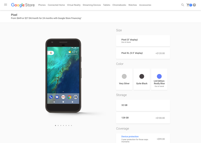
Fast loading has always been a priority for Google, but it’s especially important for ecommerce. Being fast and efficient helps users get what they want without waiting. The Google Store site loads in just over a second, which is good because every extra second a user has to wait makes them more likely to leave. The Google Store isn’t just fast loading though. It is efficient as well. Their checkout process allows the user to frictionlessly move from cart to confirmation. Google knows if you are a new or returning user even if you aren’t logged in, so they don’t bother asking if you are a new/returning user or if you want to register/continue as a guest. All these unnecessary questions just make it harder for a user to check out.
7. Simple: Adding Clarity and Digestibility to Finance
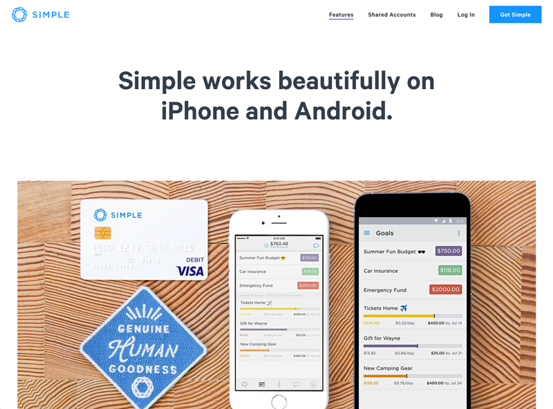
Simple is a bank that is different from all other banks. Not only do they have a sense of humor and personality as a brand, but they also have great customer service. On top of that, their website and app are designed to add clarity to your personal finances. The highlight is their Safe to Spend amount, which is calculated based on your available balance minus your bills and savings goals. This clarity on what you have to spend makes online banking a much better experience. The information presented in their app is always simple and digestible, allowing you to clearly see where you are spending your money and how much you have saved. Simple does this through both the simplicity of design and by understanding what information is most important to users.
8. Nest Thermostat: Invisible Design
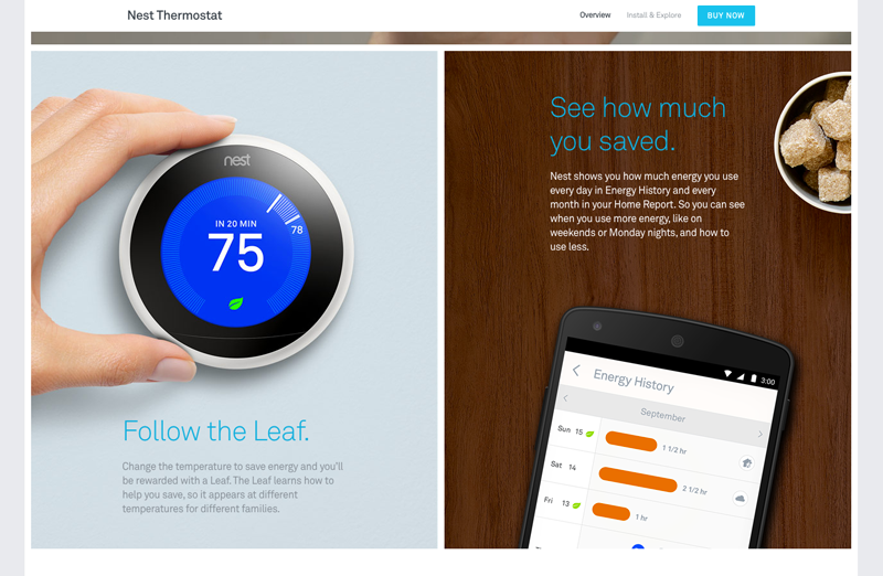
Good design is invisible—meaning the user doesn’t notice the design while they are using it. Users only need to focus on the task at hand. Nest takes this a step further using learning algorithms to allow their thermostat to set itself without being programmed by the user. Nest is invisible because the design is literally unseen by the user. Unfortunately, there were reports of users sensing a loss of control with early versions of Nest. Smart technology is great in principle, but sometimes it fails, and when it does, users need to have override control. With the recent Google acquisition of Nest, hopefully these issues will be resolved because the concept of Nest and other invisible devices like it are promising.
9. Habitica: Using Gamification for Productivity
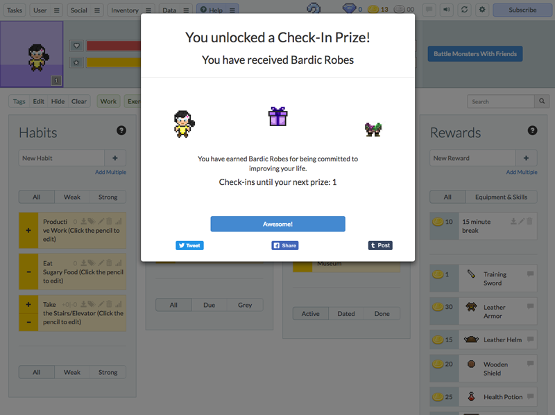
Many websites and apps are using elements of gamification but looking less and less like games. Habitica is literally turning your to-do list into a game. You get coins and experience points by checking things off your list, but be careful if you fail to do all your daily tasks—then you get docked points. Once you have reached level three, you can start going on quests and buy swords and armor for your battles with the coins you earn. Considering how boring a typical to-do list is, the fact that you can make a game out of it to motivate people to be more productive is pretty awesome. I know of a few software companies that could stand to take a page out of Habitica’s book.
10. Yelp: Everything Findable
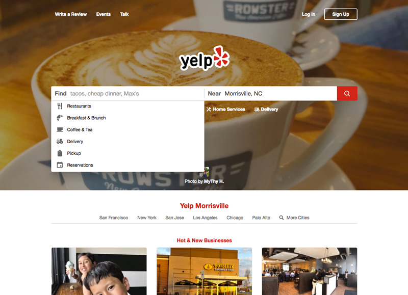
Yelp does many things right, all of which result in exceptional findability. First they use smart defaults by using your current location, allowing you to search and providing a list of frequently searched options. On the search results page, a combination of reviews and helpful filters aid the user to the perfect destination. Yelp also uses Google Maps for users who have a specific geographic region in mind. The map helps the user refine their search (five star donuts in a two block radius). The use of Google Maps also lends a sense of instant familiarity for most users. Who hasn’t used Google Maps? On the location detail page, you can quickly get all the info you need, including hours, menus, directions, top reviews and tips. Plus, Yelp is now taking it a step further and allowing you to order pickup or delivery. I’m sure reservations are coming soon too.
11. Bonus Example: From the Internet Archive (Poncho)
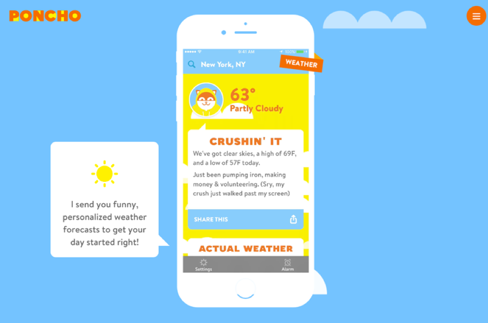
Poncho, the local weather cat, started in 2013 humanizing technology and delighting users with humor and conversation rather than using more conventional (and sterile) user interface elements and tone. Poncho makes good use of the humanizing principal by giving the app a face, personality, and of course, humor. This infuses a sense of emotion into what is actually just ones and zeros. Unfortunately, Poncho was acquired in 2018 and then shut down.
Contact our UX team to help you stand out in the crowded digital marketplace.